Your document-layout model scores an mAP of 0.38. Is that good? Bad? Production-ready? You genuinely can’t tell — and that’s not your fault. The metric itself is the problem. This is a 10-minute tour of why, and of a small library that gives you an answer you can act on.
The metrics everyone already uses
Train a layout model today and three numbers come out of the box, all inherited from general object detection:
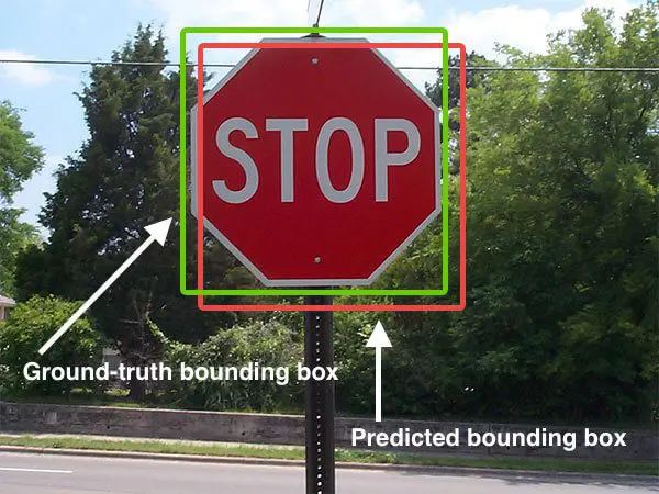
- IoU (Intersection over Union) — how much a predicted box and a ground-truth box overlap, as a fraction of their combined area. It’s the basic yardstick: line the two boxes up, divide the shared area by the total.
- F1 — once IoU decides which predictions “count” (usually IoU > 0.5), precision and recall fold into a single hit-rate.
- mAP (mean Average Precision) — the headline leaderboard number: the area under the precision–recall curve, averaged across classes.
These won the field for good reasons. They’re simple, they powered the benchmarks — PASCAL VOC, COCO — that drove the object-detection boom, and every dataset and tool reports them, so they’re the common language for comparing models. Document-layout models adopted them by default.
The trouble is that a page isn’t a photograph.
Photos aren’t pages
IoU, F1, and mAP were built for photographs: 2D projections of a 3D world where objects overlap and occlude each other. A document page is a different beast. It’s a 2D tessellation: text tiles the surface with no gaps and, crucially, no overlaps.
The granularity trap
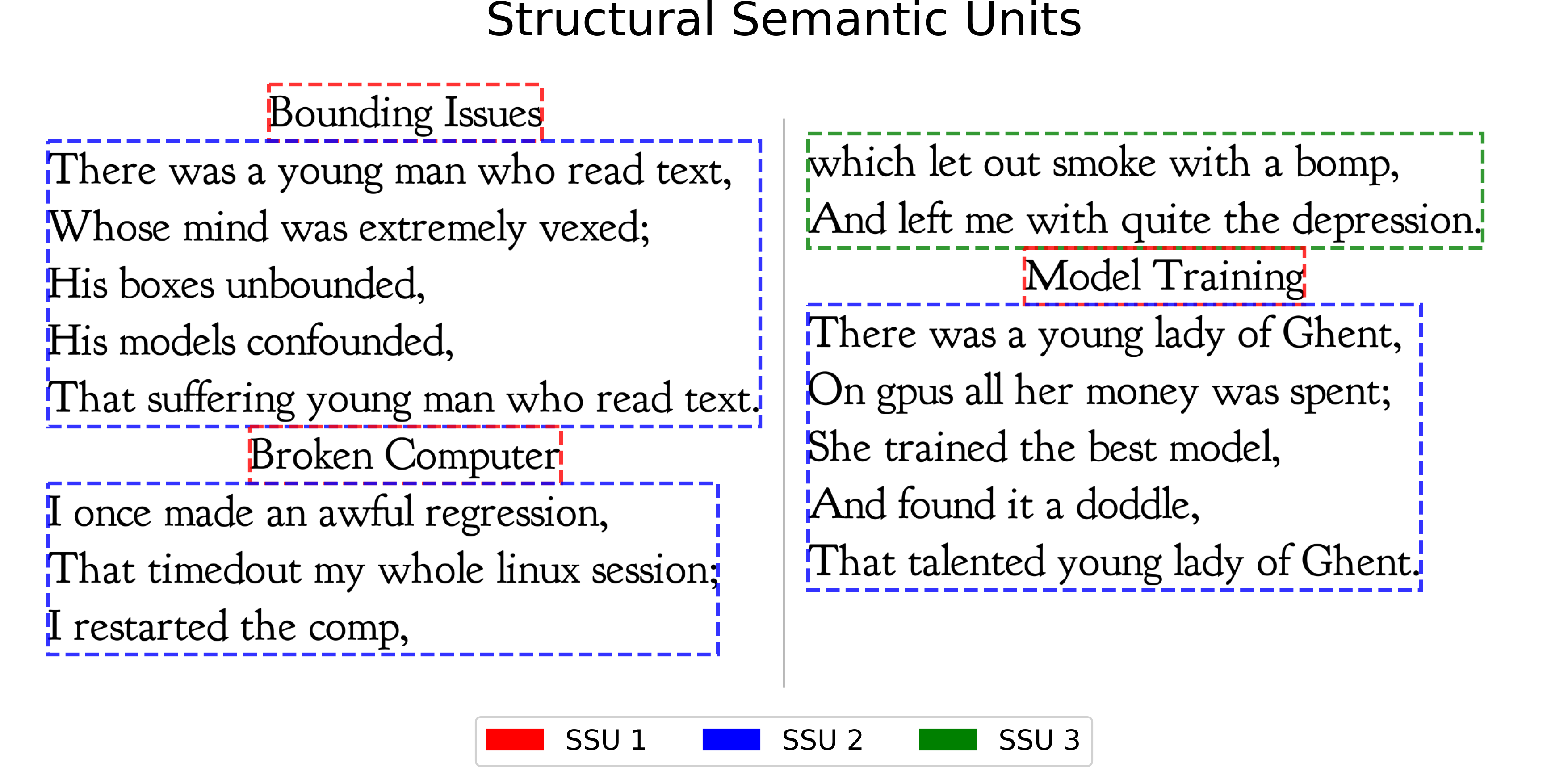
Here’s the same page content scored two ways. The ground truth labels it as three lines (left); the model draws its own boxes over the identical text (right). Every word is captured exactly once — the parse is perfect. Only the box granularity changes. Flip between coarser, aligned, and finer.
F1 pairs boxes one-to-one by overlap, so it only scores well when the model’s granularity happens to match the labels — the aligned case, where every box finds a partner (green lines). A notch coarser or finer and those matches vanish: the predictions turn red, F1 collapses to 0.00, even though the extracted text is identical. COTe scores against the whole semantic unit, so it stays pinned at 1.00. That sensitivity to an arbitrary labelling choice is exactly why a low mAP tells you so little.
A better question: decompose the error
So drop the single number. The COTe score asks four separate, readable questions about a parse instead of collapsing everything into one. Drag the boxes below and watch each one move.
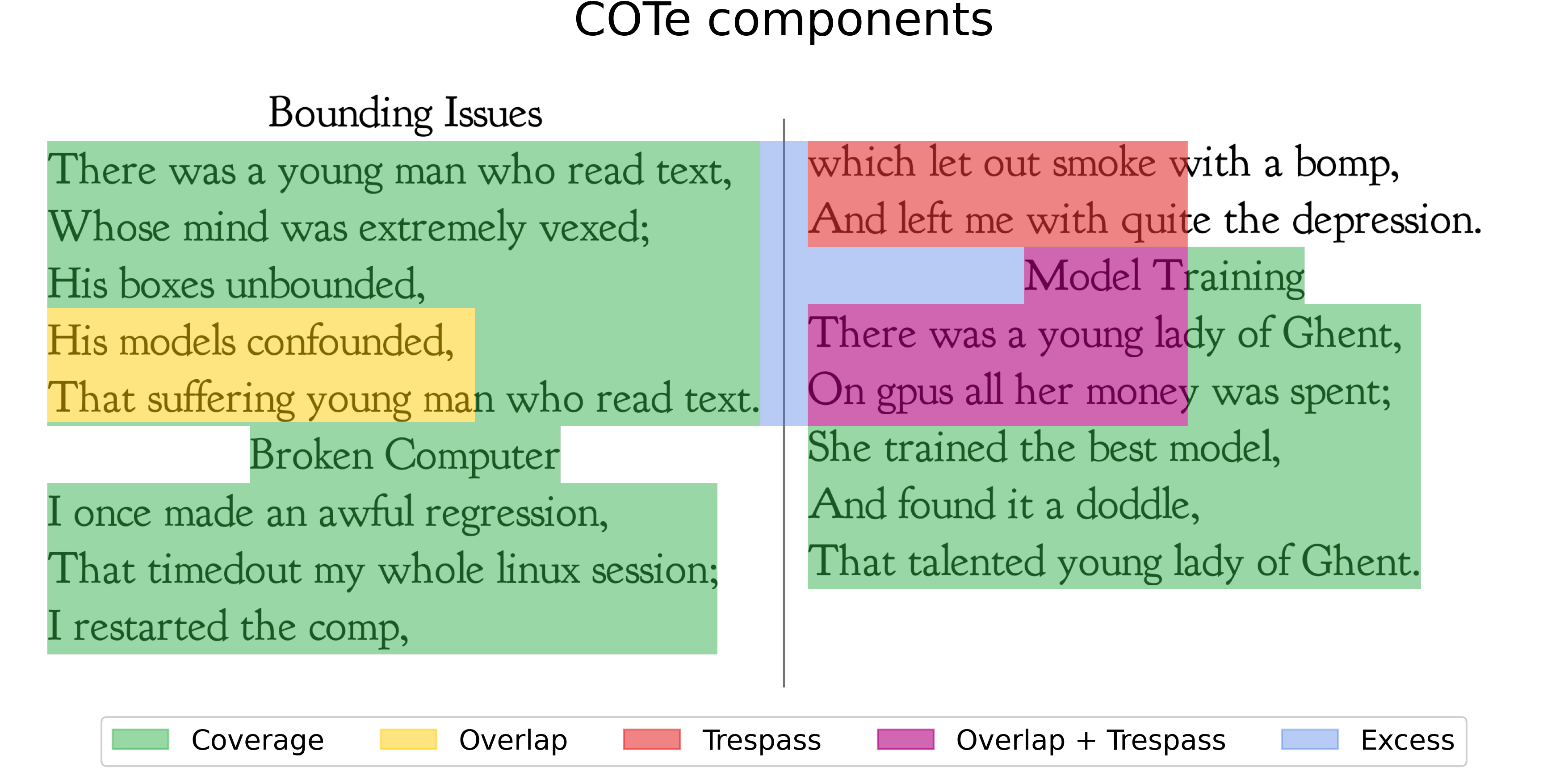
Each part is measured against the area of the ground-truth content:
- Coverage — how much of the content got predicted at all.
- Overlap — content covered by more than one box (stacked predictions — impossible to read cleanly).
- Trespass — a box bleeding into a different semantic unit, merging unrelated text.
- Excess — predicted area landing in the margins, outside any content.
The headline score is simply:
$$\text{COTe} = \mathcal{C} - \mathcal{O} - \mathcal{T}$$
Coverage you want; Overlap and Trespass you pay for. A perfect parse is 1.0;
a single box smeared across the whole page can even go negative.
That phrase “semantic unit” is doing real work. COTe groups the ground-truth text into Structural Semantic Units (SSUs) — blocks that belong together, like one article in one column — instead of scoring loose individual lines. A box only trespasses when it crosses from one unit into another.
Run a real prediction over those units and the four COTe signals light up exactly like the interactive above — green where a box cleanly covers content, yellow where boxes stack, red where one trespasses into a neighbour, purple where it does both:
Real models, real failures
Here’s the payoff. On the same newspaper page, three popular models earn wildly different COTe scores — and the decomposition tells you exactly how each one fails, not just that it did.
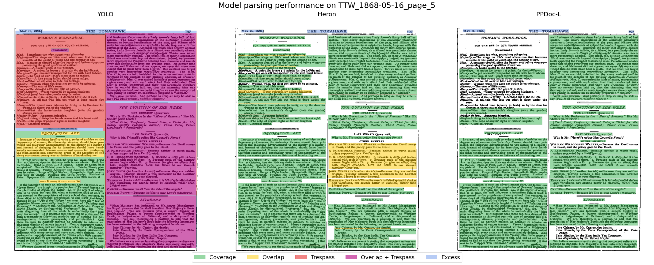
DocLayout-YOLO covers almost everything (Coverage 0.98) but smears boxes across column boundaries (Trespass 0.99, Overlap 0.54), landing at COTe −0.55 — worse than predicting nothing. Heron and PP-DocLayout cover a little less but keep their boxes clean, scoring around 0.65. IoU and F1 rate all three as mediocre and never surface the difference — so they’d send you off to “improve the model” when the real fix is post-processing the boxes you already have.
Use it
The COTe score ships as a small Python library:
pip install cotescore
Point it at your predictions and ground truth and you get the four components back per page, plus helpers to visualise exactly where boxes trespass or stack. If your ground truth is labelled at paragraph level, you get most of COTe’s robustness for free — no special annotation required.
The full method (including the Structural Semantic Unit labelling that makes COTe granularity-robust) is in the paper: arXiv:2603.12718 · code.